Sunday 11 December 2011
What have you learnt from your audience feedback?
Here are some examples of the sort of feedback that I received;
Here are a combination of the key words that I received throughout all of my feedback;

Here are a combination of the key words that I received throughout all of my feedback;

Feedback has been a very important aspect when it comes to ensuring that my media products are done to the best way possible. It allows me to understand what the audience like and what will attract them to the product.
From my feedback I have learnt that just because you have a theme doesn't mean that everything to do with your media products has to follow that theme, variety is also a good thing. I learnt this when trying to keep everything very simplistic, however this made it look more childish and less professional, this was particularly clear in my Digipak feedback.
I have also learnt to take on board to good points that is offered in my feedback and continue to emphasise on them, this became mainly clear from my music video and Digipak feedback with the colours and the crawling, and then the colour and use of images. However it has been consistently clear throughout all of my media products when it comes to the use of imagery, colour and boldness, and relating to the title.
My magazine advert feedback allowed me to make drastic changes and completely change my aim, instead of looking to keep it simple but yet eye catching, I was more looking towards the outcome of it staying in relation to the title through colour and the use of imagery but at the same time looking for it to be sophisticated and elegant.
My feedback allowed me to understand what was good about my media products and encouraged me to work on emphasising on them. And it also helped me to notice the faults that I had made, and therefore to make the correct altercations in order for my media products to be of better quality.
In what ways does your media product use, develop or challenge forms and conventions of real media products?


Here are some snap shots showing where my Music Video has challenged forms and conventions of real Music Video's;

These are all ways in which my music video uses and develops conventions which it does more of than challenges, however it does also challenge them in one particular way, by mixing footage from an old Panasonic camera with a new cannon HD camera, this has been done in order to look unusual when over edited and played with.

Friday 9 December 2011
Final Music Video
CONSTRUCTION
After noticing that there was little time by which we could film, this meant taking time out of the media lesson in order to do the filming, this was good as a lot of the reshooting that needed to be done was outside, and with it being early afternoon this meant we had good lighting in order to do so. My reasons for completely refilming was because of the lack of quality from the camera i had used previously. Therefore I was now using a better camera cannon 500, which allowed me to get good quality shots.

Although I like the previous locations we had no way of getting there and the camera wasn't fully charged therefore we needed somewhere which was close to access of a plug. Rheannes (my actress) garden contained all the areas that allowed us to have more than one completely different set shots, for example we managed to get shots from an alley way consisting of a brick wall, high steps with grass area in the background linking to the lyrics of the song "the grass is greener on the other side", and on ground where there was a lot of colour from the flowers in the background.


We also came up with a new outfit idea for the ground shots of the flowers, to emphasise on the colour and help exaggerate the theme to the title of the song.

With plugs not being far by, this meant we were able to charge the camera and play the music at the same time, meaning the filming was able to go smoothly, the only problem that restricted us a little was the weather conditions as it began to rain. We began to resolve this by holding an umbrella over the camera in order to stop it from getting wet, however the need to keep moving around with the different setting and the need for moving shots meant that this was difficult, therefore I decided when I felt I had enough footage and moved onto doing the inside shots. Although the fact that I had access to a white wall the sudden change in darkness outside meant that shadowing was still slightly a problem, we experimented with the lights in order to get it as better as possible and continued to film. Our only problem with the inside shots were that the camera was struggling to focus, I tried different zoom levels, and got it to where I thought it was at its best but still it wasn't perfect.

Because of the problems that occurred editing was not as easy as it had been previously as I did not feel as though I had loads to work with. After getting my footage onto the computer I renamed all the files to make the process quicker and easier for me, as I knew what was what, I then imported it into adobe premier pro along with the track. I took it upon myself to look through the footage in order to find bit which really stood out and looked good, I then placed them in the correct places for the music video. Making sure that there wasn't the same setting jumping from one to another I filled the rest of my music video ensuring that all flowed well. There were aspects from my music video draft that I very much liked and after collecting feedback it seemed as though others did too that I wanted to carry on into my final music video, this included the part at the start where Rheanne is crawling, I thought I would work with this and make it look as weird as possible, I did what I had done previously and sped it up, but I also added a mirror of it so that it looked like there was two of her.

I also liked the use of flashing colours from my draft video which I also then included in my Final piece however I made the flashing a lot faster and added much more colour, this helps represent the title of the song. Once making sure that I had a flowing music video I then changes the brightness, contrast and colour balance of all the shots making sure that each location/setting from the filming was set to the same.
Ancillary Tasks
FINAL DIGIPAK

CONSTRUCTION
(bottom right; front cover, bottom left; back cover, top right; inside, top left; inside for CD to be placed)
After receiving my feedback I understood what i had to do in order to improve my Digipak. This meant to make it look more professional and less childish but at the same time keeping the boldness, colour and good use of imagery. Using Fireworks again I began with the front cover to my Digipak where I kept the image the same in order to keep good attributes that were noticed in my draft. I then also kept the font style of my title as i feel as though this was something that helped my Digipak to look less childish. I then altered the colour of my font from simple rainbow colours to a more unique and professional rainbow pattern. I used this same rainbow coloured pattern and changed all the track list font also. As good use of imagery was a positive that was picked up on in my Digipak draft I decided to make the most of this and add another image that i had previously taken and added it to the inside of my Digipak, this also made it less simple especially after adding the track list to the inside also, my reasons for doing this was from taking a second look at my mock up and research and noticing that it was conventional to do so. Having made alterations to the inside, this meant that use of colour was therefore taken away, however with the background to where the CD is to be placed being blank and again too simplistic, I decided to add the colours of the rainbow in stripes, again linking to the title and the fact that colour was a good aspect that was pick up on in my feedback. When it came to the back of my Digipack i noticed that this was very much a part of my Digipak which from my draft made it come across as childish, therefore i stirpped it down, looked closely into other artists backs to there albums and decided to just place the track list down the centre as when people pick up an album and turn to the back this is conventionally what they expect to see and what they look for. There was also important things missing such as information and a barcode, therefore i took it upon myself to add these in small black font showing its professionalism and importance, but at the same time not overpowering anything else. Noticing that i had nothing along the side of my Digipak i felt it necessary to add the title to the album which is conventional as when people have their CD's in a CD shelf they know what album it is.
This is an example of another artists album back that influenced my own;


FEEDBACK

My feedback suggests a lot of improvement, I feel as though I have understood my previous feedback well and done a good job at using it to make the correct improvements. Nearly everyone who gave feedback said that they thought it was a lot better, and that i have noticeably kept the attributes that worked well previously such as the use of imagery and emphasised upon them. Keeping the colour. It looks a lot less childish and links very well to my other media products and the title. However if there was one thing I were to change it would be to make it look as professional as it could have been, this could have been done by adding more, as I feel the use of information on the back cover allows that to look more professional.
DIGIPAK DRAFT

CONSTRUCTION
After analysing my Mock up and experimenting with what would best suit the theme of my products there were changes I made whilst making the draft for my Digipak. I began with the front cover, by using the image that had been used in my magazine advert also and had been took throughout the filming of my music video, therefore it showed very good links to my other media products and I feel as though it helps the album to stand out. I also liked the use of simplicity with the cover. I thought to continue the idea of simplicity with the inside of my Digipack where, where the CD goes it is completely plain, where as the other side is exaggerating with the colours of the rainbow, I chose to do this not inly to keep it simple but also to emphasise and link my Digipak more and more to the name of the song and album. I then finished with the back of my Digipak, where after carrying out research I noticed that it was conventional to have the track list on the back. I also felt as though there was not enough branding of the name on the product and therefore looked to emphasise upon this by placing it twice mirroring one another beside the track list, I continued with the emphasis of the title by adding an actual image of a rainbow. Although i am slightly pleased with the front cover of my Digipak and the use of colour, i do feel as though a lot of alterations could be made as it comes across as slightly childish and unprofessional, I feel that this is down to, too much concentration on the idea that simplicity is key.
FEEDBACK

My feedback was as negative as I expected to be and the views were very similar to that of mine. Although it seems as though again the use of imagery, colour and boldness were looked upon as a good aspect of my Digipak, there were a lot of flaws which revolved around it being too simple. It was also described as looking 'childish' and 'unprofessional'. I will take my feedback into account and take closer look at my original ideas, I will also prevent it from looking too simple by adding more and changing parts which look unprofessional. Whilst doing this however I must remember what was like about my Digipak and ensuring that it continues to link to my other media products, which was also picked up on in my feedback.
MOCK UP OF DIGIPAK

FINAL MAGAZINE ADVERT
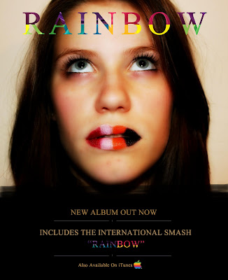
CONSTRUCTION
Although I felt I had made the necessary changes that had been suggested in my feedback, I wasn't entirely happy with the outcome. I did feel as though it met the requirements however I felt as though it could do with looking a lot more professional, therefore using fireworks, I took the title and the image and started from scratch. Using the image as the main focus again I put the title back in the original place with its new font 'Times New Roman'. I then added a black band across the bottom third in order to hold my information, this way i felt it would look more formal. After doing so i continued to add the information taking away the four star rating and adding just as if not more promotional line of 'includes the international smash "Rainbow". And also ensured formality through adding the logo for iTunes, but yet making it unique by altering the colour of it to match better with the rest of the advert. Once the information had been placed onto the advert, it looked a bit bare, therefore continuing to strive for elegance, I added a small patterned line underneath each line, using the line and brush tool on the fireworks programme.


The feedback from my Final magazine advert was very positive, near enough everyone described it as 'professional' 'elegant' or 'sophisticated', which was what I was looking for when improving it from the original draft. One person even said 'I have no criticisms'. I therefore feel as though I have very much achieved what I set out to do with my Magazine advert and am happy with the way it has turned out. Although I made the necessary changes and i made a lot of them, it seems as though people have noticed the original attributes that have stayed from the original advert and this has allowed me to keep the good qualities that it had in the beginning of colour, boldness and good use of imagery.
SECOND ATTEMPT

After receiving feedback from my first draft of my magazine advert i began to understand the changes that i should make in order to make my magazine advert come across as less childish and more sophisticated, but at the same time keeping its original good attributes of having colour and boldness, and using the use of imagery effectively. I therefore began by keeping the main image as I feel this links very well to my other media products and helps the adverts to stand out. I then looked into changing the font of the title in order to make it look more elegant,Ii also repositioned the title whilst experimenting with the changes I could make and added another line of information 'Also Available On iTunes'.
MAGAZINE ADVERT DRAFT

CONSTRUCTION
By following my mock up i think i achieved the outcomes that i set out for. I began by editing the close up shot of Rheanne that was taken during filming and therefore will have great relation to the music video, to make it stand out more and her skin to look better, i then looked to my mock up for guidance as to how i was going to layout my magzine advert and i exprimented with different fonts. Sticking to the simplistic but colourful and bold theme i went with a normal font 'arial black' but altered it to suit my magazine advert better by using the colours of the rainbow, this also relates to the title itself. I then used the four star rating and 'New Album Out Now!' in order to promote the album through my magazine advert. I used again another normal traditional font such as 'times new roman' to really emphasise that simpicity is key, and tell the audience but as the image is the min part of my magazine advert i did not want to over power this.
FEEDBACK

The feedback came back quite positive, the audience seemed to like the idea of the magazine advert not overflowing with text and the use of boldness and colour through my imagery. However it seemsas though the main criticism is that is possibly to simple and not sophisticated enough, although they are happy with not too much text the majority do not fee as though i have offered enough and also that the font used possibly in the title is too childish and this could be altered in order to make my magazine advert more sophisticated. I will bare this in mind when it comes to producing my final magzine advert.
MOCK UP OF MAGAZINE ADVERT


CONSTRUCTION
(bottom right; front cover, bottom left; back cover, top right; inside, top left; inside for CD to be placed)
After receiving my feedback I understood what i had to do in order to improve my Digipak. This meant to make it look more professional and less childish but at the same time keeping the boldness, colour and good use of imagery. Using Fireworks again I began with the front cover to my Digipak where I kept the image the same in order to keep good attributes that were noticed in my draft. I then also kept the font style of my title as i feel as though this was something that helped my Digipak to look less childish. I then altered the colour of my font from simple rainbow colours to a more unique and professional rainbow pattern. I used this same rainbow coloured pattern and changed all the track list font also. As good use of imagery was a positive that was picked up on in my Digipak draft I decided to make the most of this and add another image that i had previously taken and added it to the inside of my Digipak, this also made it less simple especially after adding the track list to the inside also, my reasons for doing this was from taking a second look at my mock up and research and noticing that it was conventional to do so. Having made alterations to the inside, this meant that use of colour was therefore taken away, however with the background to where the CD is to be placed being blank and again too simplistic, I decided to add the colours of the rainbow in stripes, again linking to the title and the fact that colour was a good aspect that was pick up on in my feedback. When it came to the back of my Digipack i noticed that this was very much a part of my Digipak which from my draft made it come across as childish, therefore i stirpped it down, looked closely into other artists backs to there albums and decided to just place the track list down the centre as when people pick up an album and turn to the back this is conventionally what they expect to see and what they look for. There was also important things missing such as information and a barcode, therefore i took it upon myself to add these in small black font showing its professionalism and importance, but at the same time not overpowering anything else. Noticing that i had nothing along the side of my Digipak i felt it necessary to add the title to the album which is conventional as when people have their CD's in a CD shelf they know what album it is.
This is an example of another artists album back that influenced my own;


This shows my Digipak being produced in Fireworks.
FEEDBACK

My feedback suggests a lot of improvement, I feel as though I have understood my previous feedback well and done a good job at using it to make the correct improvements. Nearly everyone who gave feedback said that they thought it was a lot better, and that i have noticeably kept the attributes that worked well previously such as the use of imagery and emphasised upon them. Keeping the colour. It looks a lot less childish and links very well to my other media products and the title. However if there was one thing I were to change it would be to make it look as professional as it could have been, this could have been done by adding more, as I feel the use of information on the back cover allows that to look more professional.
DIGIPAK DRAFT

CONSTRUCTION
After analysing my Mock up and experimenting with what would best suit the theme of my products there were changes I made whilst making the draft for my Digipak. I began with the front cover, by using the image that had been used in my magazine advert also and had been took throughout the filming of my music video, therefore it showed very good links to my other media products and I feel as though it helps the album to stand out. I also liked the use of simplicity with the cover. I thought to continue the idea of simplicity with the inside of my Digipack where, where the CD goes it is completely plain, where as the other side is exaggerating with the colours of the rainbow, I chose to do this not inly to keep it simple but also to emphasise and link my Digipak more and more to the name of the song and album. I then finished with the back of my Digipak, where after carrying out research I noticed that it was conventional to have the track list on the back. I also felt as though there was not enough branding of the name on the product and therefore looked to emphasise upon this by placing it twice mirroring one another beside the track list, I continued with the emphasis of the title by adding an actual image of a rainbow. Although i am slightly pleased with the front cover of my Digipak and the use of colour, i do feel as though a lot of alterations could be made as it comes across as slightly childish and unprofessional, I feel that this is down to, too much concentration on the idea that simplicity is key.
FEEDBACK

My feedback was as negative as I expected to be and the views were very similar to that of mine. Although it seems as though again the use of imagery, colour and boldness were looked upon as a good aspect of my Digipak, there were a lot of flaws which revolved around it being too simple. It was also described as looking 'childish' and 'unprofessional'. I will take my feedback into account and take closer look at my original ideas, I will also prevent it from looking too simple by adding more and changing parts which look unprofessional. Whilst doing this however I must remember what was like about my Digipak and ensuring that it continues to link to my other media products, which was also picked up on in my feedback.
MOCK UP OF DIGIPAK

Just like my magazine advert I look to emphasise on colour, boldness and the use of imagery. Although i aspire to ensure that my Digipak is at a very high standard I also look for there to be very clear links between my media products in order to make all of them relevant. Following this idea I plan to use the same image to what I did in my magazine advert, again with a colourful title positioned along the top. The colour I feel will help draw attention to the album and the use of imagery will make it come across as more intriguing. I also then plan to use another image that i have already taken with the same actress in order to emphasise on the similarities between the media products and a Doberman. After researching and looking into other Digipaks i notice that the track list is often placed on the inside as well as the black, I look to do the same in order to match traditional conventions. Keeping simplicity as a very important method when planning my Digipak i thought of the idea to add an extreme close up of colourful lips to the back of my Digipak, which is also going along with a theme i have of different coloured lips throughout my music video and the images used in my magazine advert. Colour being another important aspect of my whole theme, I think that exaggerating this on the background to where the CD is to be placed will help continue the whole theme of the products and title of the song, therefore i plan to use stripes of the colour of the rainbow.
FINAL MAGAZINE ADVERT

CONSTRUCTION
Although I felt I had made the necessary changes that had been suggested in my feedback, I wasn't entirely happy with the outcome. I did feel as though it met the requirements however I felt as though it could do with looking a lot more professional, therefore using fireworks, I took the title and the image and started from scratch. Using the image as the main focus again I put the title back in the original place with its new font 'Times New Roman'. I then added a black band across the bottom third in order to hold my information, this way i felt it would look more formal. After doing so i continued to add the information taking away the four star rating and adding just as if not more promotional line of 'includes the international smash "Rainbow". And also ensured formality through adding the logo for iTunes, but yet making it unique by altering the colour of it to match better with the rest of the advert. Once the information had been placed onto the advert, it looked a bit bare, therefore continuing to strive for elegance, I added a small patterned line underneath each line, using the line and brush tool on the fireworks programme.

FEEDBACK

The feedback from my Final magazine advert was very positive, near enough everyone described it as 'professional' 'elegant' or 'sophisticated', which was what I was looking for when improving it from the original draft. One person even said 'I have no criticisms'. I therefore feel as though I have very much achieved what I set out to do with my Magazine advert and am happy with the way it has turned out. Although I made the necessary changes and i made a lot of them, it seems as though people have noticed the original attributes that have stayed from the original advert and this has allowed me to keep the good qualities that it had in the beginning of colour, boldness and good use of imagery.
SECOND ATTEMPT

After receiving feedback from my first draft of my magazine advert i began to understand the changes that i should make in order to make my magazine advert come across as less childish and more sophisticated, but at the same time keeping its original good attributes of having colour and boldness, and using the use of imagery effectively. I therefore began by keeping the main image as I feel this links very well to my other media products and helps the adverts to stand out. I then looked into changing the font of the title in order to make it look more elegant,Ii also repositioned the title whilst experimenting with the changes I could make and added another line of information 'Also Available On iTunes'.
MAGAZINE ADVERT DRAFT

CONSTRUCTION
By following my mock up i think i achieved the outcomes that i set out for. I began by editing the close up shot of Rheanne that was taken during filming and therefore will have great relation to the music video, to make it stand out more and her skin to look better, i then looked to my mock up for guidance as to how i was going to layout my magzine advert and i exprimented with different fonts. Sticking to the simplistic but colourful and bold theme i went with a normal font 'arial black' but altered it to suit my magazine advert better by using the colours of the rainbow, this also relates to the title itself. I then used the four star rating and 'New Album Out Now!' in order to promote the album through my magazine advert. I used again another normal traditional font such as 'times new roman' to really emphasise that simpicity is key, and tell the audience but as the image is the min part of my magazine advert i did not want to over power this.
FEEDBACK

The feedback came back quite positive, the audience seemed to like the idea of the magazine advert not overflowing with text and the use of boldness and colour through my imagery. However it seemsas though the main criticism is that is possibly to simple and not sophisticated enough, although they are happy with not too much text the majority do not fee as though i have offered enough and also that the font used possibly in the title is too childish and this could be altered in order to make my magazine advert more sophisticated. I will bare this in mind when it comes to producing my final magzine advert.
MOCK UP OF MAGAZINE ADVERT

I very much like the idea of keeping my magazine advert simple, and allowing the use of imagery and colour to draw the audience in. The image that i plan on using i a close up that was took during filmin so that it therefore ver much relates to my music video, and the use of colour through the make up is able to be shown off at same time. In order to keep it simplistic i plan on not overcrowding te advert with information, however i do still seek to promote therefore i will add the infrmtion such as 'New Album Out Now!' and 'Also available on iTunes' as well as showing its four star rating. By not adding too much information i believe that this will leave the audience feeling intrigued after looking at the advert and will therefore seek to buy the album which is being promoted.
Thursday 8 December 2011
Logo Ideas

Although I like all of these ides and I think they all represent the song in some way, I began with the idea of taking the name and using it with an unusual font. However my muic video is very much just based simply on performance and it uses colur very much so as a way of making the performance relevant, I then felt it was important to do the same with my logo, therefore I went for options involving th colour of the rainbow. To continue to ensure that it links well to my music video and song, i feel as though I should go for the one that looks the most simple. The bottom one is the one I feel is most relevant.
Music Video Draft
CONSTRUCTION
With both me and Rheanne having college during the day and other priorities over the weekend, we had to make sure that we planned a time by which we could both film to begin with, this meant using free periods during the afternoon. We began by going to the location that was outside in order to prevent lighting being a problem as it seemed to be getting dark quite early on. This also meant that we had less chance of the battery dyeing whilst we were outside and had nowhere to charge it with it being the first place we filmed. However we did have the problem of Rheanne not knowing every lyric to the song and as my filming is very much concentrated on Rheanne performing, it was important that she did, therefore we resolved this by playing the song from the car so that Rheanne was able to hear it and therefore practice before filming. In order to ensure that i got all the shots i needed, i decided to go through the whole song numerous of time in different places and using different camera angles and movements. The main problem when shooting outside was the weather, as towards the end it began to rain and with having nothing to cover the camera to prevent it from getting damaged it meant accepting that enough was enough.
The shots inside we did at night, and began by recharging the camera to ensure that filming would run smoothly, the main problems we had were being able to get the camera far back enough for the long shots against the white wall, which i resolved by moving to a different room that was larger. And also specifically the shadowing when filming the close ups, as we had no daylight to prevent this, we altered the lighting within the room as much as possible but at the same time it was essential for us to remember that it still needed to be light enough for us to see the shot clearly.
The things that went wrong I have picked up upon and will definitely change for next time, where will think about lighting and shadowing and also weather conditions for when I am filming outside.

FEEDBACK

After putting my feedback into wordle it eem as though it generally was liked. as 'good' is noticed as the most used word, looking in order from what is most used, i gather that the reasons for the postive feedback from the audience was because of my use of editing, and the speeding up of some shots. I agree with my audience feedback that the main criticism would be the lack of high definition quality, especally with my music video beng very much performance based. I gather hat the arts in the video that were specificaly liked were when Rheanne is walking down the road and crawling at the beginning, this may be because both were made faster. I will bare this in mind when i go to edit again.
Permission
Permission has been a problem when i was looking for what track i wanted to use. Originally i had a different track in mind, but yet permission was declined as due to copyright issues.
I therefore had to search elsewhere for a new track, and i chose one which i thought would very much suit the actress that had agreed to perform in my music video. This track is called 'Rainbow' and here is my evidence to show that i had very much seeked permission;


I therefore had to search elsewhere for a new track, and i chose one which i thought would very much suit the actress that had agreed to perform in my music video. This track is called 'Rainbow' and here is my evidence to show that i had very much seeked permission;


Thursday 1 December 2011
Lyrics to track 'Rainbow'
Rainbow
We're the colours of the rainbow (oh)
Rainbow
He grew up in the city
Had a lot of money
Sponging off his daddy all the time
He lives in a bubble
Never had to struggle
He's far from the benefit line
But he feels blue sometimes
And he blood bleeds red like mine
The grass is greener on the other side
What I'm saying is we're all alike
We're the colours of the rainbow (yeah, yeah)
Let's share our pot of gold
We're the colours of the rainbow (yeah, yeah)
Everybody's on the yellow brick road
There's enough for you, you, you
There's enough for me, me, me
We're the colours of the rainbow (yeah, yeah)
We're the colours of the rainbow (yeah, yeah)
(Rainbow (x7)
There's mummy in the ghetto
Gotta work it double
Just to pay the bills and get by
But more power to ya
You're doing what you do-a
Everybody's steady on the grime
But you feel blue sometimes
And you're blood bleeds red like mine
The grass is greener on the other side
What I'm saying is we're all alike
We're the colours of the rainbow (yeah, yeah)
Lets share our pot of gold
We're the colours of the rainbow (yeah, yeah)
Everybody's on the yellow brick road
There's enough for you, you, you
There's enough for me, me, me
We're the colours of the rainbow (yeah, yeah)
We're the colours of the rainbow (yeah, yeah)
Hello, hello
Why does everybody get so mad?
Yellow, yellow
It's the colour for the battle in my head
I have a beat in my life like love in my heart
The sun up in the sky as we rock with the stars
We just cant keep fighting anymore
No, no, no
We're the colours of the rainbow (yeah, yeah)
Lets share our pot of gold
We're the colours of the rainbow (yeah, yeah)
Everybody's on the yellow brick road
There's enough for you, you, you
There's enough for me, me, me
We're the colours of the rainbow (yeah, yeah)
We're the colours of the rainbow (yeah, yeah)
We're the colours of the rainbow
Risk Assessment
RISK
|
WHAT MAY HAPPEN
|
HOW TO PREVENT IT
|
Health and safety of both me and those on set
|
A lot could happen on set, this includes people tripping over wires, injuries whilst the performer is dancing, people possibly tripping over things that are already in the location, and also any hazards that the location may bring.
|
I will prevent these risks, by not leaving wires just lay about, i will ensure that people walk around them, I will ask that my performer will warm up before carrying out any strenuous activity, i will make sure that no obstacles are in the way on arrival of the location, and look out for any hazards within the location such as cars, roads, ect.
|
Damage to the camera
|
There are many ways in which there can be accidental damage to the camera such as it being dropped, or accidentally pulled by someone tripping over wires coming from the camera.
|
This will be prevented by ensuring that everyone is aware where the wires are, and keeping good hold of the camera, and having it placed in its bag when not in use. Also i will ensure that everyone around can be trusted.
|
Damage to the camera equipment such as the tripod
|
Camera equipment such as the tripod could be broken down to misuse or accidentally from dropping or banging it against something.
|
I will ensure that not damage is done by allowing myself to be taught how to use all equipment properly before doing so, and also ensuring that when I am using it that i handle it with care.
|
Weather conditions
|
There is always a risk of the weather not going to plan, rain gives the risk of the camera and equipment getting wet. And if the weather conditions become dangerous then this may affect me and those being filmed.
|
Weather conditions cannot be controlled, however if there is light rain i will make sure that all equipment being used a long with the camera is sheltered to prevent any damage. And if the conditions do get too bad i will make the decision to stop filming and reschedule for another time.
|
Transporting problems
|
Depending on how the cast and crew plan on getting to the location of the filming there may be obstacles and risks of the way of transport breaking down, or people turning up at different times.
|
This cannot be prevented other than making it so that everyone takes the same transport to the location and goes together. And if someone cannot make it then to make the most of what is there and also reschedule for another time on top of that.
|
Filming schedule
After discussing when is best for both me to film and my actress, we took int consideration all he obstackes we had such as college, work, but yet still ensuring that it was light making it more suitable for us to film. This meant looking into any free time we both had during the day.
I am glad that i am only using 1 person to be filmed in my music video as this allowed the filming to be a lot less complicated.
This will result in us having 2 days to film for the draft of my music video;
Tuesday 13th September = 12noon - 3pm
Sunday 18th September = 1pm - 4pm
I am glad that i am only using 1 person to be filmed in my music video as this allowed the filming to be a lot less complicated.
This will result in us having 2 days to film for the draft of my music video;
Tuesday 13th September = 12noon - 3pm
Sunday 18th September = 1pm - 4pm
Costume & Props
As i plan on the setting and theme of my music video being very urbanised, i feel as though tere is someting that needs to be a little out there and makes the music video stand out a bit. I also plan on making my music video very much performance based, therefore the costume and props used is a very important aspect of my music video.
Thankfully the actress i am using already hasa wardrobe full of quirky clothing and make up which i plan on taking full advantage of. Here are some idea's of the sorts of clothing i plan to use in my music video;

The make up i also plan on making wacky, focusing on the lips using different colours to help represent the title of the song.


ACTRESSThe actress i plan on using is called 'Rheanne Clarke' as i fee she is comfortable performing infront of the camera and suited the style of the song well. I am choosing to only have one performer in my music video in order to keep it simple with all the fast pace and variety of shots. Also the song is only sang by one female therefore it makes sense as i do not look to be following any sort of storyline by which more peope would be needed.

Thankfully the actress i am using already hasa wardrobe full of quirky clothing and make up which i plan on taking full advantage of. Here are some idea's of the sorts of clothing i plan to use in my music video;

I plan on making the outfits very mix and match and not taking much care into what goes or what is in fashion, this isbecause of my idea of producing a musc video that comes across slightly wacky.
I also plan to add a lot o jewellery. In particular a lot of necklaces.The make up i also plan on making wacky, focusing on the lips using different colours to help represent the title of the song.


ACTRESSThe actress i plan on using is called 'Rheanne Clarke' as i fee she is comfortable performing infront of the camera and suited the style of the song well. I am choosing to only have one performer in my music video in order to keep it simple with all the fast pace and variety of shots. Also the song is only sang by one female therefore it makes sense as i do not look to be following any sort of storyline by which more peope would be needed.

Location
Because of the fact tha the song i am using comes across as very urban, i feel as though it woud be a good idea to match this by using urban areas in order to fulfill this idea. This is to include backgrounds such as a brick wall or a lot of colour.
Firstly i plan on filming on a private road that has a long brick wall down the side of it. a lot of grass area, broken down trees and a road. With the road being private this will make it easier to film as there will be less distractions and everything within the area can be experimented with and put to good use in order to make my music video as good as possible.This is located close to the queens medical centre ans i about a ten minute drive away.

Secondly i plan on filming in a friends garden, this is because there is such a variety of different aspect that could be used, for example, there are deep steps that would allow me to make the most of different camera angles throughout my filming, there are also a lot of flowers which would enhance the idea of adding a lot of colour into my music video, and along the side of the house there is an alley way with a brick wal either side, allowing me to emphasise on the idea of making my music video urban themed.


For my inside shots i plan on using a friends house again as this will allow me to use a plain white wall, so that when filming it is actuall what is going on in the shot that is more important rather than the background. I chose to use a friends house as it mkes things easier for the actress that i plan on using to get there and back.
(addpicture)
Brainstom

I began by lookig at the four main factors that will influence a great deal on the outcme of my music video.
Beginning with whether or not my music video is to be performanced based or to follow a storyline. I evaluated what would be best and came down to the conlusion tha i would stick with it being performance based as it wuld sui the style a lot more than what a narrative would.
Costume and theme is a very important aspect of planning for my music video, however every idea flowed in the direction of it giving off a wacky and different impression to the audience, and also ensuring colour.
This then closely links into the location and setting, as to where my filming is to be done, after doing my shot by shot analysis of a similar music video inspiration, i plan to follow the guidelines of having three/four different settings/locations with the same amount of outit changes. And as thre is no narrative what so ever, i feel that the location is something that i would have to ensure links to the lyrics of the song so that it is not completely irrelevant.
The shot by shot analyis has very much influenced my planning for the filming and editing, as i look for similar features with fast cuts throughout to give the impression of it being at fast pace, and there being a variety of different camera angles and shots. I also would like the editing to be done effectively with it being very muh performance based, as i go for a wacky theme, the editing should help represent this, this may be done through colour changes of the shots, or adding effects.
Thursday 6 October 2011
Questionnaire & Results
In my questionnare the question I thought would be useful to ask were the following;
How old are you?
Are you male or female?
What is your favourite music video?
What is it about music videos that you like best?
What genre music do you prefer?
In a Music video do you like there to be more of a storyline or more performance?
On the front of CD covers/Digipaks what do you like on them?
Is there anything in particular that would make you want to buy a CD when it comes to packaging or promotion?
Do you take much interest in CD adverts when reading magazines?
Is there anything that would attract you to a CD advert in particular?
How old are you?

Are you male or female?

What is your favourite music video?

What is it about music videos that you like best?

What genre music do you prefer?

From the genres listed, it is clear that Urban/R&B music is the most preferred style of music. This could be becase it is the most modern genre on there and young people typically seem to listen to more modern music, and when looking at the results from the first question of 'how old are you' we can see that the majority of those who took my survey were in between the age of 15 and 20.
In a Music video do you like there to be more of a storyline or more performance?

On the front of CD covers/Digipaks what do you like on them?

Is there anything in particular that would make you want to buy a CD when it comes to packaging or promotion?

Most of those who took my survey do not see that there is anything in particular that will attract them to wanting to by a CD when it comes to packaging and promotion. However those whodidm suggested things such as bright colours and distinctive images.
Do you take much interest in CD adverts when reading magazines?

Is there anything that would attract you to a CD advert in particular?
 When asked if there was anything that would attract those who took my survey to a CD advert proves that there is, those who voted 'yes' suggested things just like them of the digipacks, with 'bright bold colours' 'distinctive images' ect. I will take this into account when creating a CD advert.
How old are you?
Are you male or female?
What is your favourite music video?
What is it about music videos that you like best?
What genre music do you prefer?
In a Music video do you like there to be more of a storyline or more performance?
On the front of CD covers/Digipaks what do you like on them?
Is there anything in particular that would make you want to buy a CD when it comes to packaging or promotion?
Do you take much interest in CD adverts when reading magazines?
Is there anything that would attract you to a CD advert in particular?
How old are you?

After asking the question 'How od are you' to those who took my questionnaire, the results have mad cear that i asked more people who were in between the age of 15 and 20, this is likely to be down to the fact that my friends are of that age and they were good and close enough options for them to do my questionnaire. The age where by the least questionnaires were used, were them of over 45 years old, i used less of an older age as i know that they are less likely to watch Music video's than peope younger than them. ages that range from 20-40 years od are quite evenly spread and in between 40 years of age and 45 is reasonably high, which will be down to the asking of parents ect.

More females took my questionnaire than males, this will be because of availability and who was able and willing to take my questionnaire. Although there are more females than males that answered the questions, there is not too much of a difference for my results to become biased because of gender.

From the videos given as results from the questionnaire, although a majority chose 'other' they suggested a music video that that would be for them, video's such as lady gaga's bad romance was bought up, along with other performing videos. From the videos givn as multiple choice, i seems that modestep-sunlight and Jessie J-Nobodys perfect were most liked, this could be because they are the most risky and wild of all the videos.

As hgathered from the resultsof the previous question. These results just verify that it is the idea of pushing boundries and being risky that seems to make a music vdeo good. having colour also seeed to be well like by those who took my survey. Those whochose 'other' suggested things such as he videos being'different', 'wild', and 'having a theme'

From the genres listed, it is clear that Urban/R&B music is the most preferred style of music. This could be becase it is the most modern genre on there and young people typically seem to listen to more modern music, and when looking at the results from the first question of 'how old are you' we can see that the majority of those who took my survey were in between the age of 15 and 20.
In a Music video do you like there to be more of a storyline or more performance?

When asked the question 'in a music video do you like there to b more of a storyline or more performance?' its clear that most of the people asked prefer to see performance in a music video. however i will take into account that there was not too much of a difference between those who liked performanced in comparison to those who like a storyline, i may do this by setting a possible theme.

On the front of digipacks it is noticeable that images of the artist is what was chosen most to be seen on the front of a digipack, along with colour. However some still did chose 'writing and information' i will
take this into account when producing my digipack.

Most of those who took my survey do not see that there is anything in particular that will attract them to wanting to by a CD when it comes to packaging and promotion. However those whodidm suggested things such as bright colours and distinctive images.
Do you take much interest in CD adverts when reading magazines?

It seems that using those who took my survey as a representative, majority of people seem to take interest in CD adverts in magazines. This tells me that i should taje extra care in ensuring my advert is done to the best of my ability in rder to attact potential customers in such wasy of marketing and promotion.

Thursday 29 September 2011
Wednesday 21 September 2011
Research into famous Music Video Director/s
http://youtu.be/E1mU6h4Xdxc
The music video for "Disturbia" was filmed on July 1, 2008 in Los Angeles, California. First, it was reported that originally the video was directed by American photographer and director, David LaChepelle, who previously directed Christina Aguilera's "Dirrty" (2002) and Gwen Stefani's "Rich Girl".


David LaChapelle (born March 11, 1963 in Fairfield, Conneticut) is a photographer and director who works in the fields of fashion, advertising and fine art photography, and is noted for his surreal, unique, sexualized, and often humorous style. LaChappelle is better known for his extreme choice in style when it comesto photography. It is always quite easy to notcie the kind of work that is his as it pushes the boundries a lot of the time, which is really a part of what has made music videos what they are today, he specifically does ths particularly in Rihanna's 'disturbia' video.


http://youtu.be/qrO4YZeyl0I
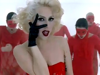
Francis "Frank The Rat" Lawrence was born on March 26th 1970 in Vienna and is an American music video and film director. Francis Lawrence is well known for directing the films 'I Am Legend' and 'Water For Elephants' and music videos such as Justin Timberlakes 'Rock Your Body', Jennifer Lopezs 'Jenny From The Block' and many more including Lady GaGas 'Bad Romance'. Also he has directed many commercials such as Disneyland, Coca Cola and Bacardi. The fact that Francis Lawrence has directed such varied style music videos suggests that he is very versatile and doesnt just have one genre that he is particularly skilled at but can direct a music video no matter who the artist or what they are looking for.


During an interview with Rolling Stone, Gaga confirmed that film director Francis Lawrence had directed the music video for "Bad Romance", and that she was impressed with the final version. She explained, "I knew [Lawrence's] ability as a director is so much higher than what I could [do]." Her creative team Haus of Gaga managed the art direction, and the final video premiered on November 10, 2009. Gaga described her experience of working with Lawrence:

The music video for "Disturbia" was filmed on July 1, 2008 in Los Angeles, California. First, it was reported that originally the video was directed by American photographer and director, David LaChepelle, who previously directed Christina Aguilera's "Dirrty" (2002) and Gwen Stefani's "Rich Girl".
David LaChapelle (born March 11, 1963 in Fairfield, Conneticut) is a photographer and director who works in the fields of fashion, advertising and fine art photography, and is noted for his surreal, unique, sexualized, and often humorous style. LaChappelle is better known for his extreme choice in style when it comesto photography. It is always quite easy to notcie the kind of work that is his as it pushes the boundries a lot of the time, which is really a part of what has made music videos what they are today, he specifically does ths particularly in Rihanna's 'disturbia' video.
http://youtu.be/qrO4YZeyl0I
Francis "Frank The Rat" Lawrence was born on March 26th 1970 in Vienna and is an American music video and film director. Francis Lawrence is well known for directing the films 'I Am Legend' and 'Water For Elephants' and music videos such as Justin Timberlakes 'Rock Your Body', Jennifer Lopezs 'Jenny From The Block' and many more including Lady GaGas 'Bad Romance'. Also he has directed many commercials such as Disneyland, Coca Cola and Bacardi. The fact that Francis Lawrence has directed such varied style music videos suggests that he is very versatile and doesnt just have one genre that he is particularly skilled at but can direct a music video no matter who the artist or what they are looking for.
During an interview with Rolling Stone, Gaga confirmed that film director Francis Lawrence had directed the music video for "Bad Romance", and that she was impressed with the final version. She explained, "I knew [Lawrence's] ability as a director is so much higher than what I could [do]." Her creative team Haus of Gaga managed the art direction, and the final video premiered on November 10, 2009. Gaga described her experience of working with Lawrence:
I wanted somebody with a tremendous understanding of how to make a pop video, because my biggest challenge working with directors is that I am the director and I write the treatments and I get the fashion and I decide what it's about and it's very hard to find directors that will relinquish any sort of input from the artist. But Francis and I worked together.It was collaborative. He's a really pop video director and a filmmaker. He did I Am Legend and I'm a huge Will Smith fan, so I knew he could execute the video in a way that I could give him all my weirdest, most psychotic ideas, But it would come across to and be relevant to the public
Subscribe to:
Posts (Atom)